For over a decade, Clever was known for secure automated rostering which is the backbone that kept student data flowing to learning apps. But in the last few years, rising ransomware attacks targeting K-12 districts pushed the company to expand into identity and access management.
This shift positioned Clever as a cybersecurity provider, yet the Dashboard, the primary surface used by district IT admins, still looked and behaved like a rostering tool with security features bolted on. The experience didn’t reflect the company’s new strategic focus and undermined trust, discoverability, and adoption of security capabilities.
My role was to lead a multi-team initiative to redesign the Dashboard into a cohesive cybersecurity experience.
Enterprise SaaS / Cybersecurity / Identity and access management
Industry
Role
Lead Product Designer
9 Designers, 9 PMs, 3 PDE Leaders, 1 Onboarding Specialist, 2 CSMs
XF-team
1 PM, 1 Eng manager, 8 Engineers
My product team
Defining the problem
Context
After high-profile district breaches (like the LAUSD ransomware attack affecting thousands of student records), districts were urgently reassessing their security posture. Administrators consistently told us they felt vulnerable and under-equipped. This raised a core question: How might Clever help IT admins feel more in control of their security posture before an incident happens?

User research
I conducted stakeholder interviews, two rounds of user interviews, and partnered closely with our CSM and onboarding teams. Six clear patterns emerged, revealing how fragmented cybersecurity ownership is inside districts:
01
Personnel and budget constraints: many districts have limited technical resources, forcing them to prioritize cost over security.
02
Reactive mindset: security only becomes a priority after an incident or insurance requirement.
03
Siloed teams: the person managing Clever daily isn’t the same one responsible for cybersecurity strategy.
04
Responsibility gaps: Ownership of Clever varies across roles, leading to inconsistent security oversight.
05
Persuading upper management: admins struggle to get leadership buy-in for proactive security initiatives.
06
Varied approaches: smaller districts act reactively, while larger ones prefer integrated, preventive solutions.
Most important insight
The single most important insight was that the Dashboard wasn’t just misaligned to Clever’s new strategy - it was misaligned to who it was designed for. We discovered two distinct IT admins:

The Dashboard was designed almost entirely around Joe’s workflows, leaving Brenda without the insights she needed for security monitoring and incident response. This misalignment became a major design opportunity: How might we introduce cybersecurity concepts in a way that supports two distinct IT admins with different goals?
UX Audit of the current experience
To understand where the product supported or hindered each IT admin type, I ran a comprehensive UX audit through the lens of each IT admin’s JTBD. This surfaced 3 major gaps:
Gap #1
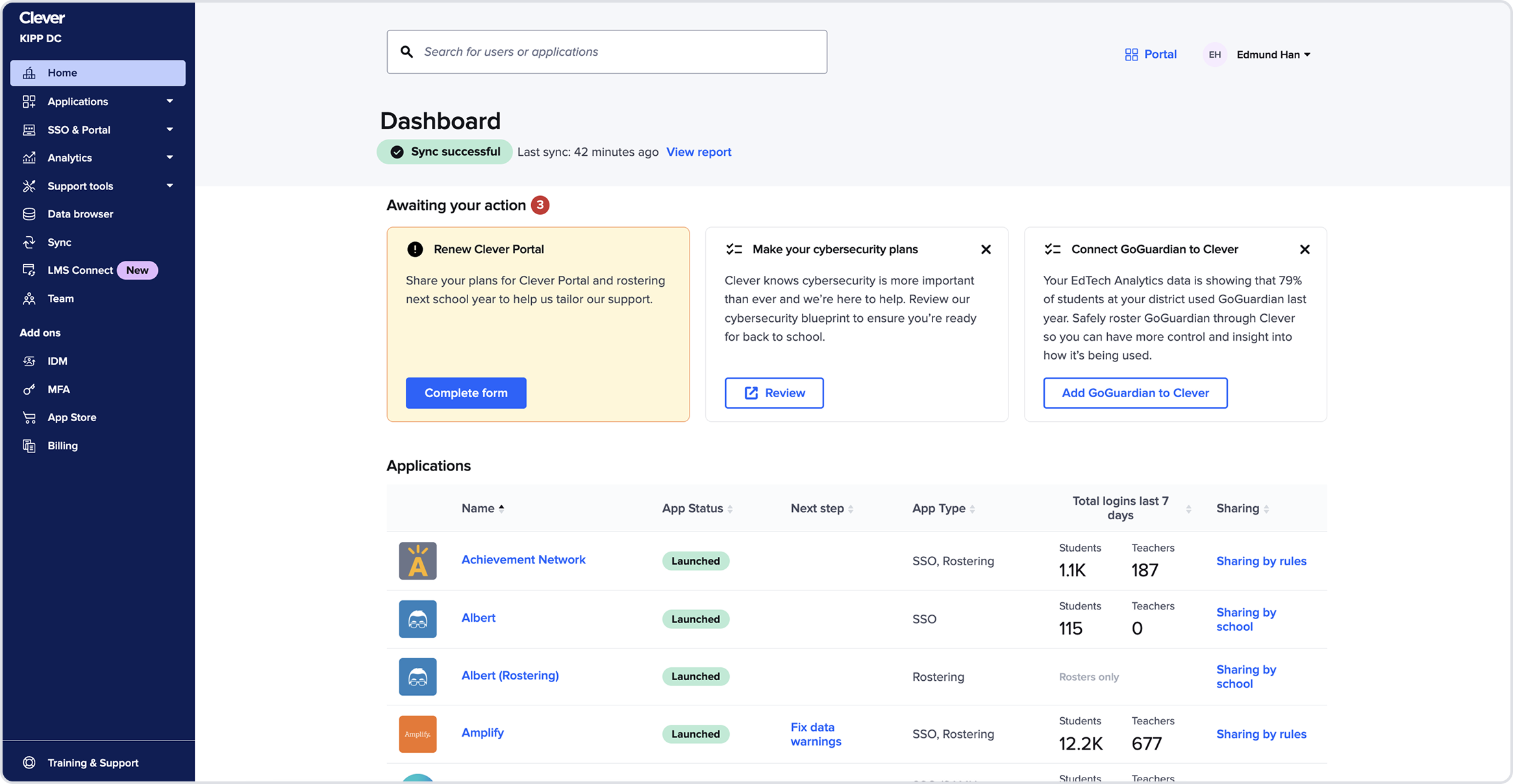
The Homepage wasn’t functioning as a homepage
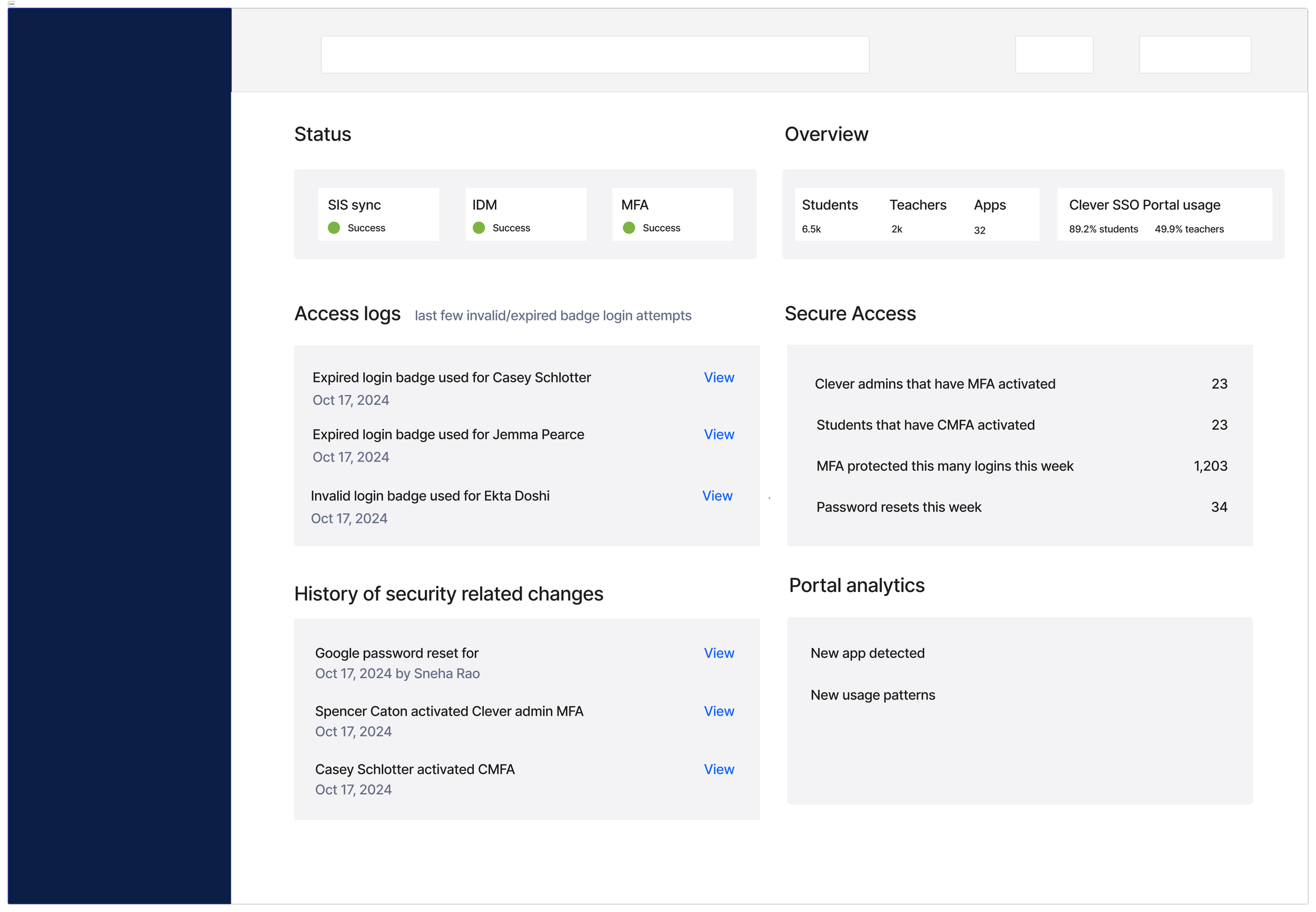
It didn’t communicate system health, security status, or identity issues. A large portion of the page was taken up by a duplicate applications table. The task section which is a growth channel dominated the layout and admins thought they were distracting.
→ Admins lacked an orienting surface for what mattered most.
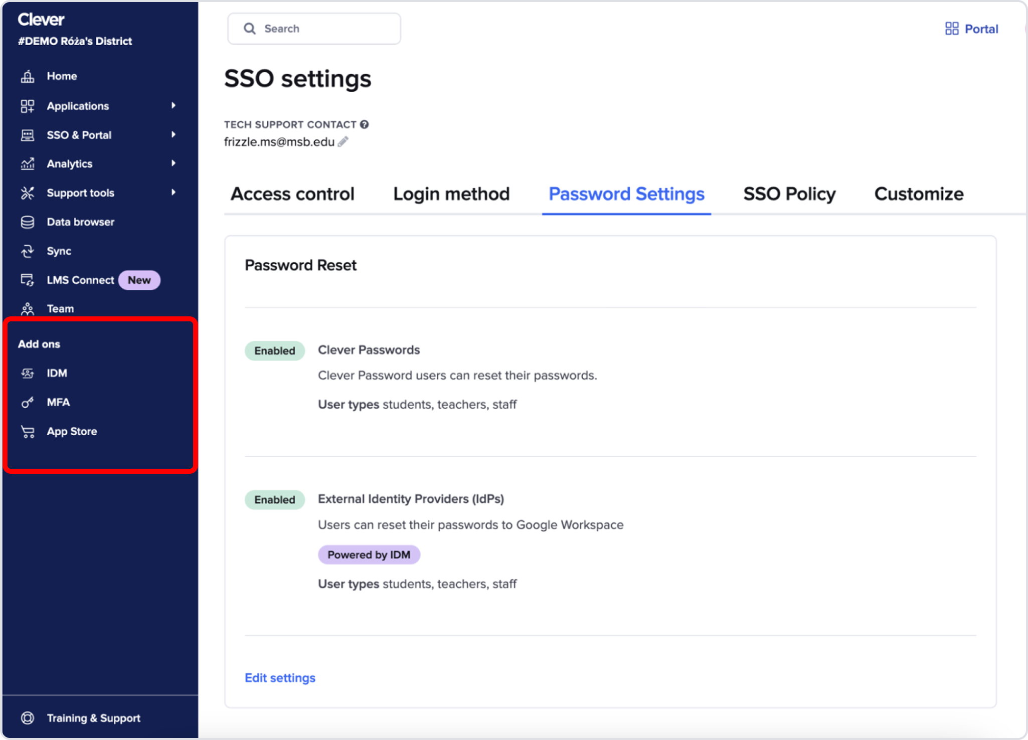
Gap #2
Security features were scattered across the IA
MFA, password policies, identity management settings, and security monitoring tools were buried in unrelated sections or labeled “add-ons.”
→ It felt like we shipped our org chart, not a coherent security product.
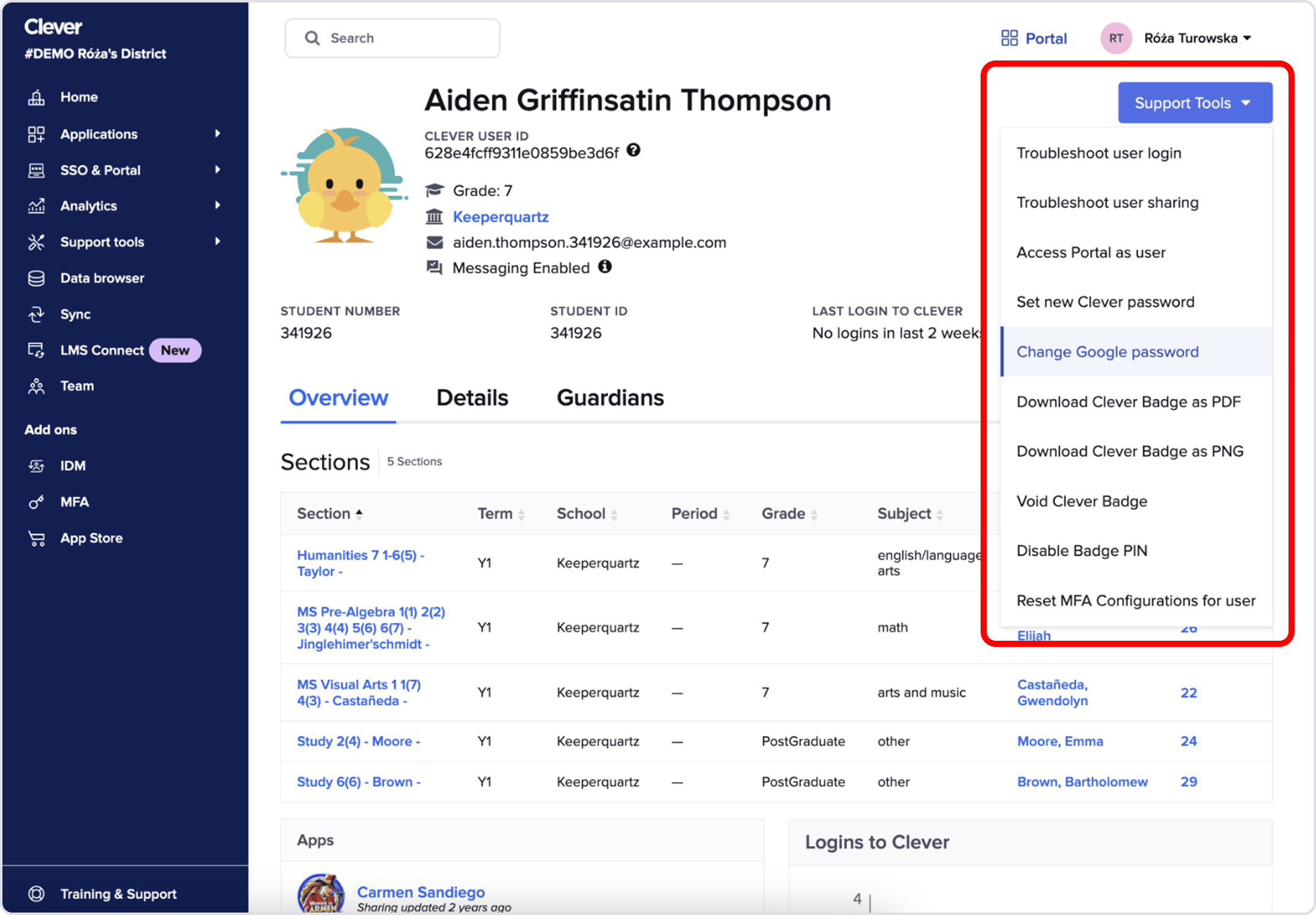
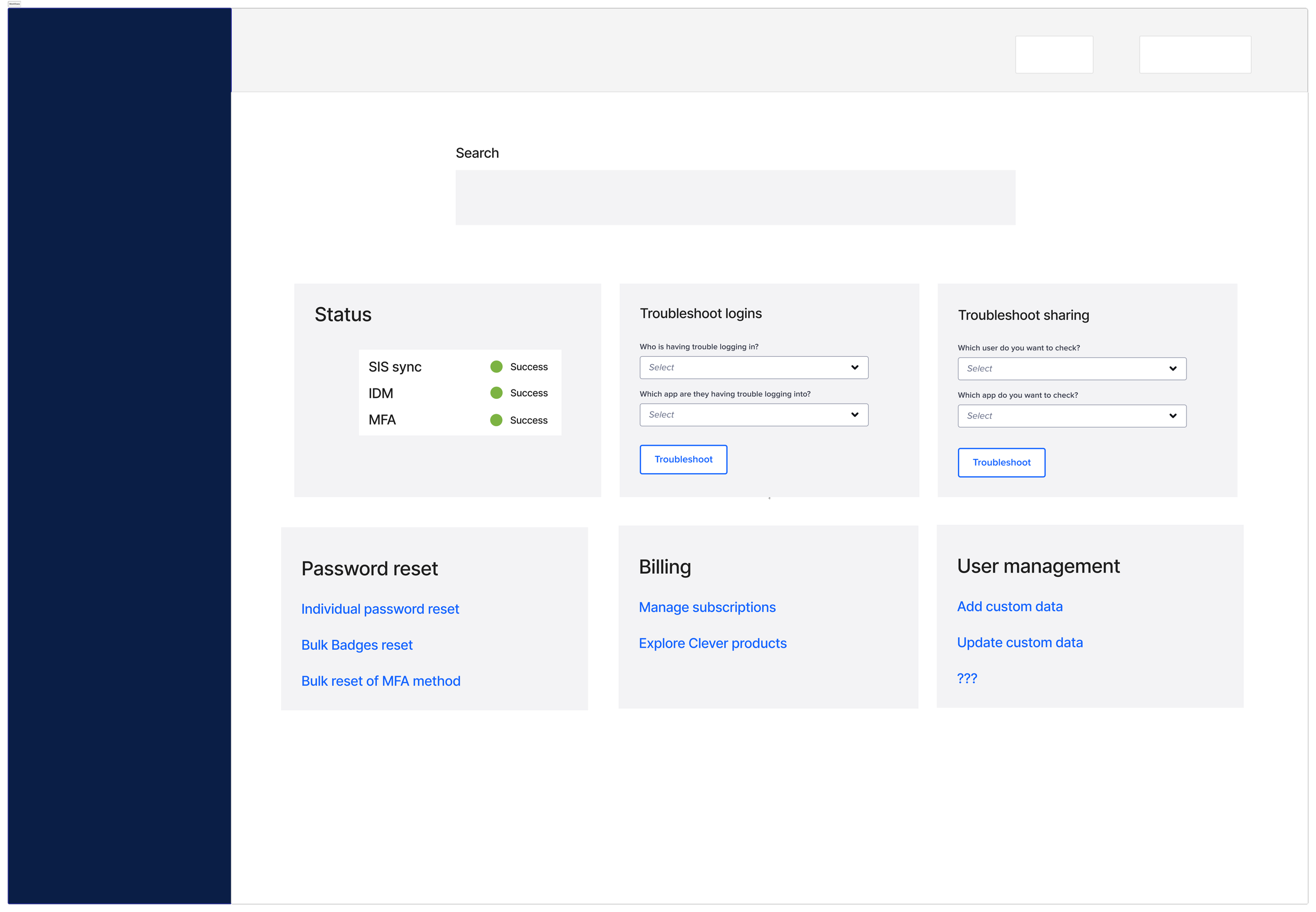
Gap #3
User Profile page clutter
The profile page had become a dumping ground for troubleshooting actions.
→ Long, unprioritized tools slowed admins during urgent situations.
Strategic recommendations
Synthesizing these gaps, we identified six investment areas:
Homepage redesign
IA redesign
User profile redesign
Security alerts
Global settings
Internal dashboard governance
These were structural, not cosmetic and each impacted trust, discoverability, and cross-team cohesion.
We aligned cross-functionally (product, engineering, PDE leadership) on sequencing and prioritized the homepage as the highest-leverage entry point because it was the most visible surface, touches the most JTBD for both personas, had the largest gap between what admins needed vs what we provided, and a redesign here would unlock the rest of the roadmap.
Homepage concept exploration
The existing homepage supported 1 out of 6 core JTBD across both personas. Before jumping into layouts, I zoomed out to explore fundamentally different strategic directions.
I intentionally created extreme, unbalanced versions to test mental models:
Alert focused
Powerful for urgency but overwhelming when systems are healthy
→ Supported 2/6 JTBD
Data focused
Great visibility but too passive and not action-forward
→ Supported 2/6 JTBD
Workflow focused
Optimized for Joe’s daily tasks but ignored Brenda’s security needs
→ Supported 1/6 JTBD
Introducing the hybrid direction
No single direction met the full range of needs across both personas because admins need different things at different times:
When everything is healthy → visibility into system health data
When something breaks → clear alerts and troubleshooting paths
For ongoing work → fast access to workflows
So instead of choosing one direction, I synthesized all three into a hybrid model.
This allowed the homepage to finally function like a true identity + security control center comprised of three components that worked together to form a single system: search, statuses, and tasks to address 5/6 JTBD across both IT admins..
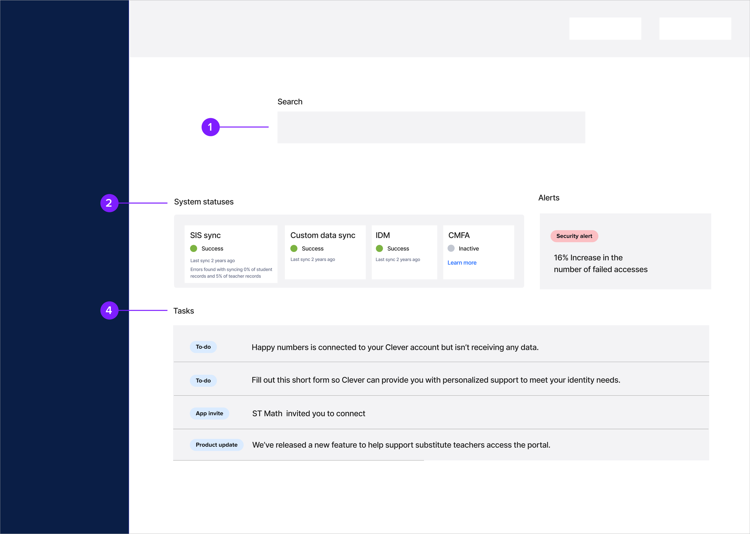
1 - Search
Joe: troubleshooting end users’ access to digital learning
Brenda: security incident response
2 - Statuses
Joe: ensure data systems are talking to each other
Brenda: security monitoring
3 - Tasks
Joe: manage what data apps can access
Design: search
Search was the most critical workflow to redesign. Nearly every troubleshooting or security incident response across both IT admin types began with identifying a user. If search didn’t work, nothing downstream worked. That made it the foundational prerequisite for a successful homepage redesign.
Before
The existing omnisearch was too limited to support real troubleshooting: it surfaced only 3 collections with 3 results per collection, admins couldn’t distinguish between students with the same name, troubleshooting required clicking into a user’s profile before taking any action
This created long, frustrating pathways for IT admins who often needed to act quickly during login failures, sync issues, or security events.
After
While observing workflows, a clear insight emerged: search wasn’t just a lookup tool it was the starting point to troubleshooting security or access issues for both IT admin types.
So I reimagined it as a direct troubleshooting surface, enabling admins to: see up to 30 results per collection, filter by collection type (student, teacher, app, contact, school…), take direct actions — reset passwords, view logs, impersonate user, reset MFA, etc. — directly from the search result
This completely collapsed a multi-step workflow into one unified surface.
Impact
We shipped the search redesign ahead of the rest of the homepage because of its leverage and cross-team impact.
The outcomes were significant: Search success increased from 76.6% → 95.5%, a +25% lift, driven by clearer results and direct action pathways. Admins can now almost always find the user they need — and resolve issues dramatically faster.
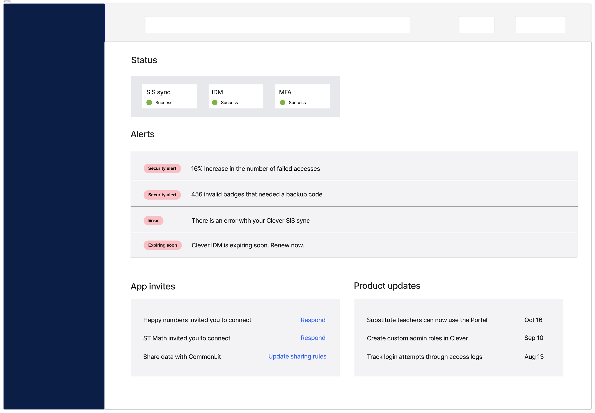
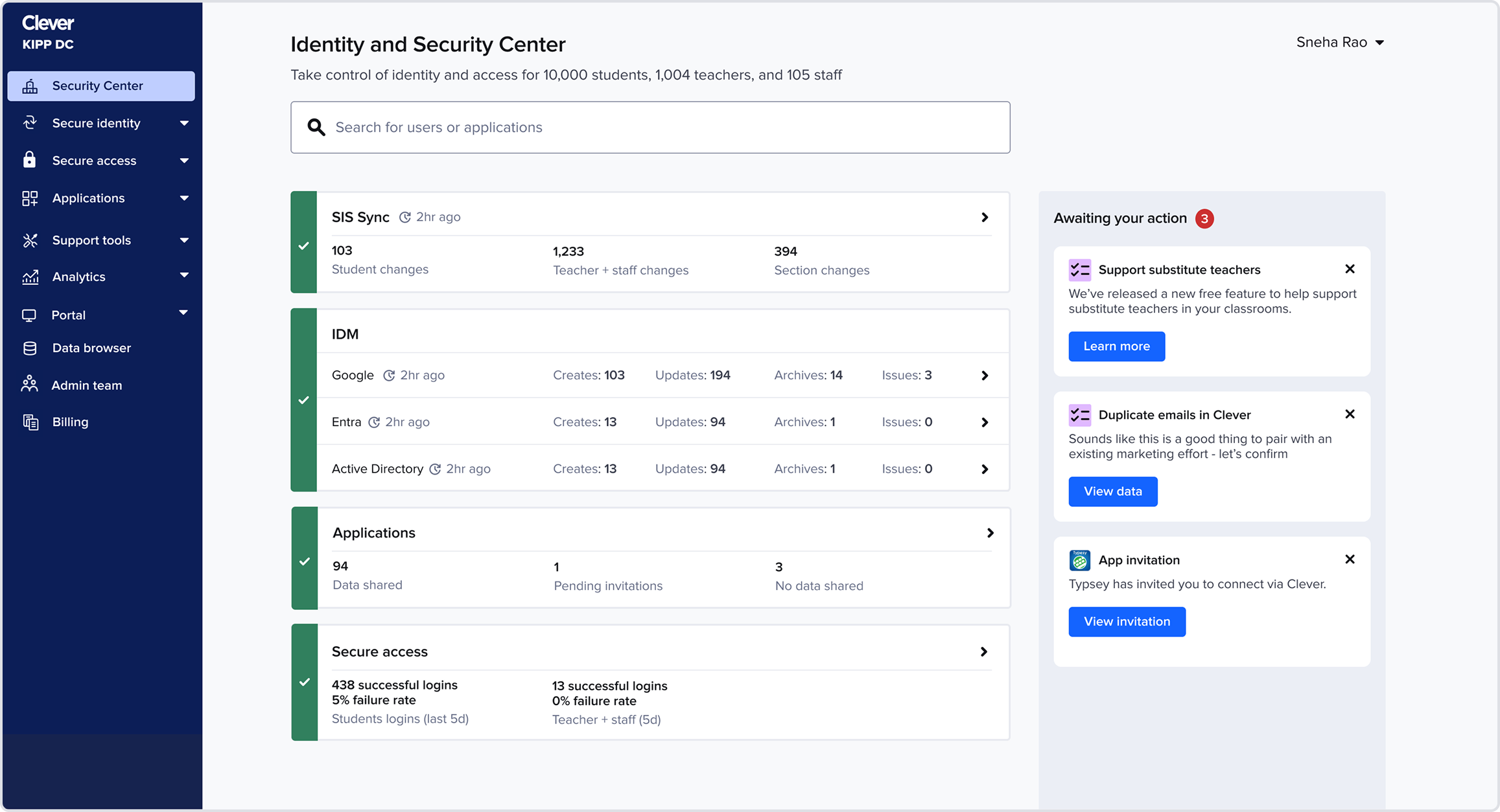
Design iteration: statuses and tasks
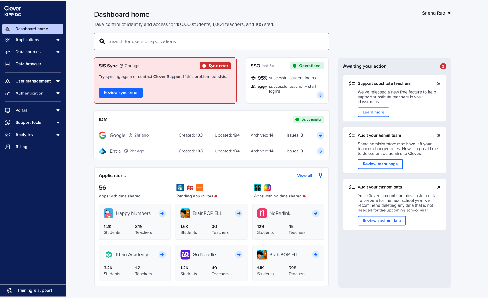
With search rebuilt, I redesigned the rest of the homepage to give IT admins a clear, real-time view of system health and the tasks that need their attention. The existing experience scattered statuses across the dashboard, buried important data, and made it hard to understand what was happening at a glance.
Iteration 1
I began by elevating core statuses (SIS sync, IDM, SSO) to the top of the homepage. Admins consistently checked these first, especially when something broke.
This approach simplified the mental model but revealed two challenges:
Challenge #1: Stakeholders expressed concerns that Tasks, a major company growth lever, were too buried
Challenge #2: The layout wouldn’t scale as Clever added more products
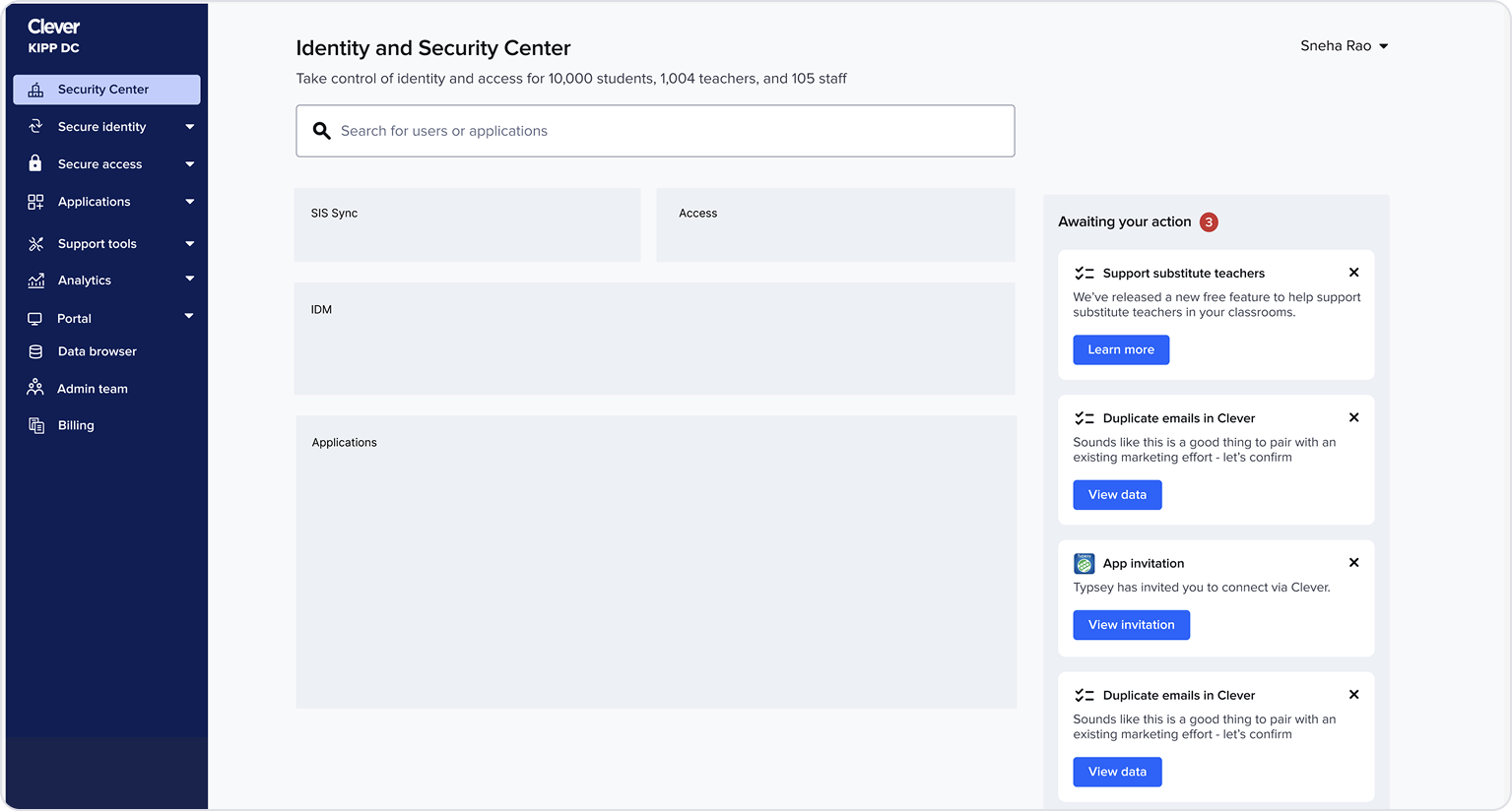
Iteration 2
I moved tasks into a right-side action panel, giving them high visibility without overshadowing system health. This also made the layout more modular and extensible.
We shipped this version as an experiment and saw immediate improvements to task completion rates:
+15% App Invite completion
+20% Audit task completion
While Tasks as a right-side action panel was working well, there were additional challenges with the rest of the homepage.
Challenge #1: In usability testing admins still missed having quick access to applications
Challenge #2: The statuses lacked variation in information density, making all statuses feel of equal importance when they weren’t
Iteration 3
I explored a wide spectrum of layouts for these statuses within the structure of Tasks being on the right. My goal: understand how much space and visual emphasis each status should have in the overall experience. By trying very different structures, I could see the edges for what felt too like too much space for a status, what felt like too little space for a status, and what was just right.
This helped me converge on a balanced layout that felt more intentional and scannable.
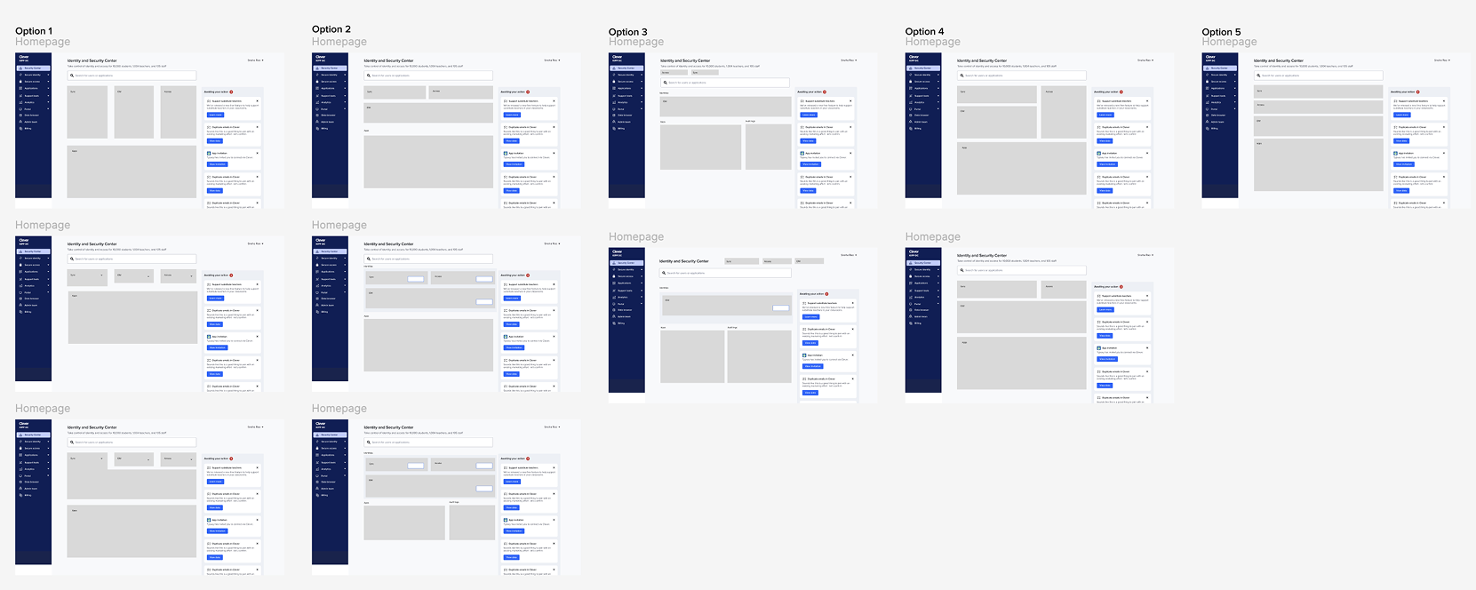
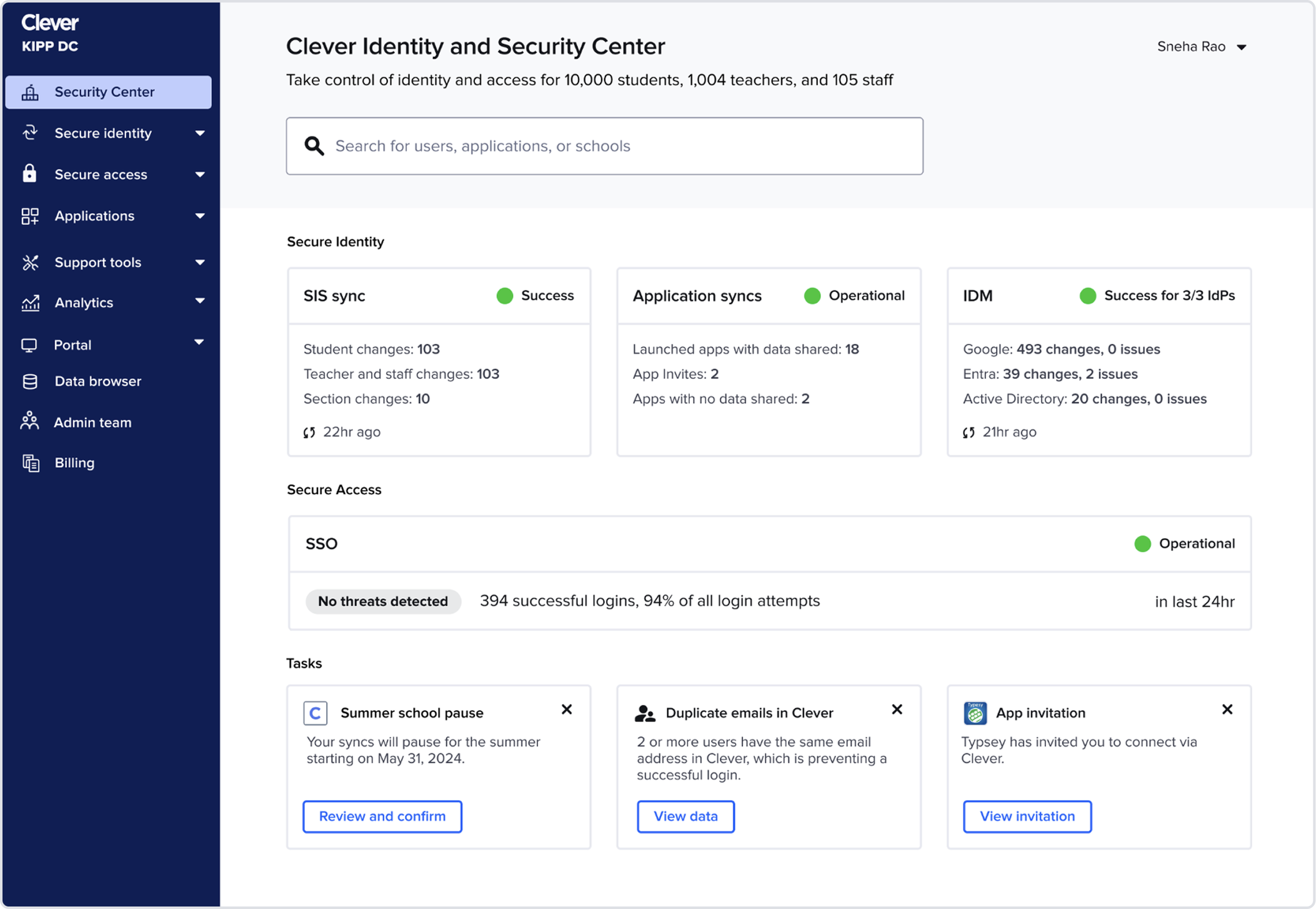
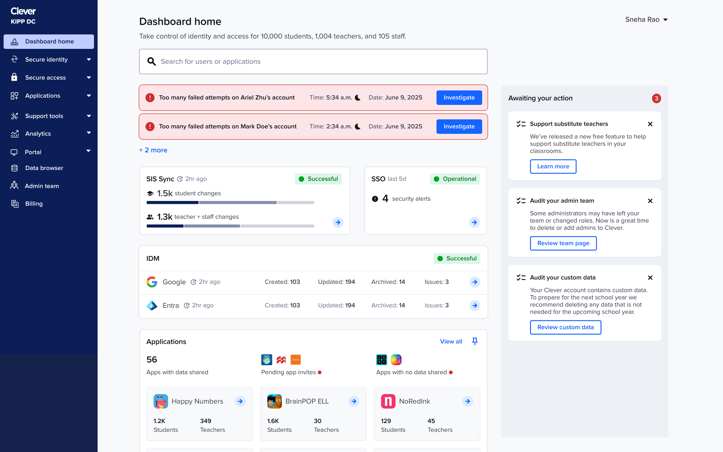
Final designs
Homepage
Reusing the validated IDM component: The IDM card from earlier testing already had the right detail level, so I reused it and focused refinement on SIS sync + SSO.
Refining SIS sync + SSO component: For SIS sync, admins needed more than a single rollup number: they wanted a breakdown of created, updated, and deleted accounts to understand whether the sync looked “normal.” To surface this without adding noise, I introduced a lightweight multi-segment bar
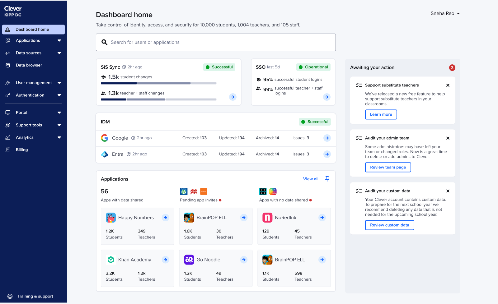
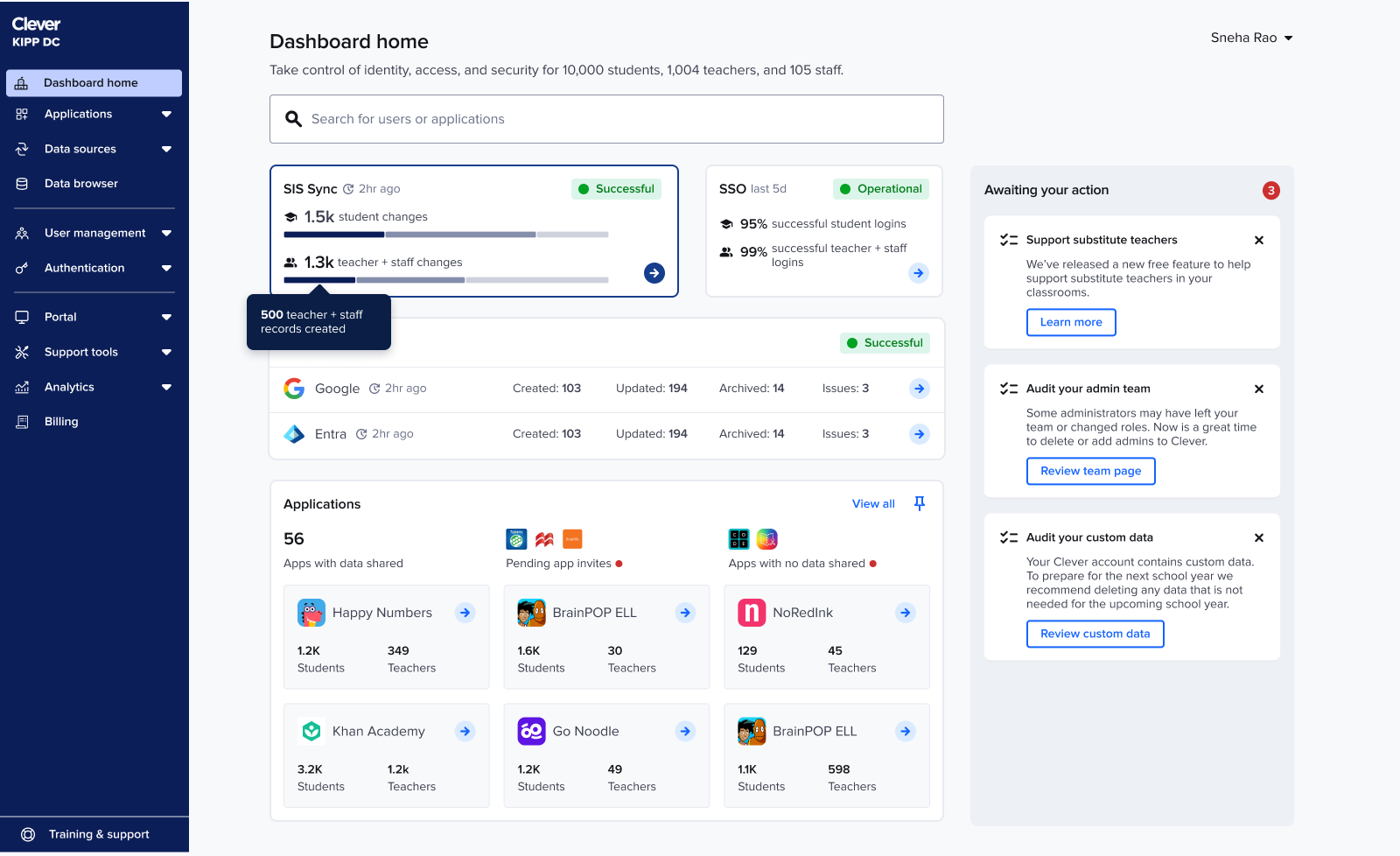
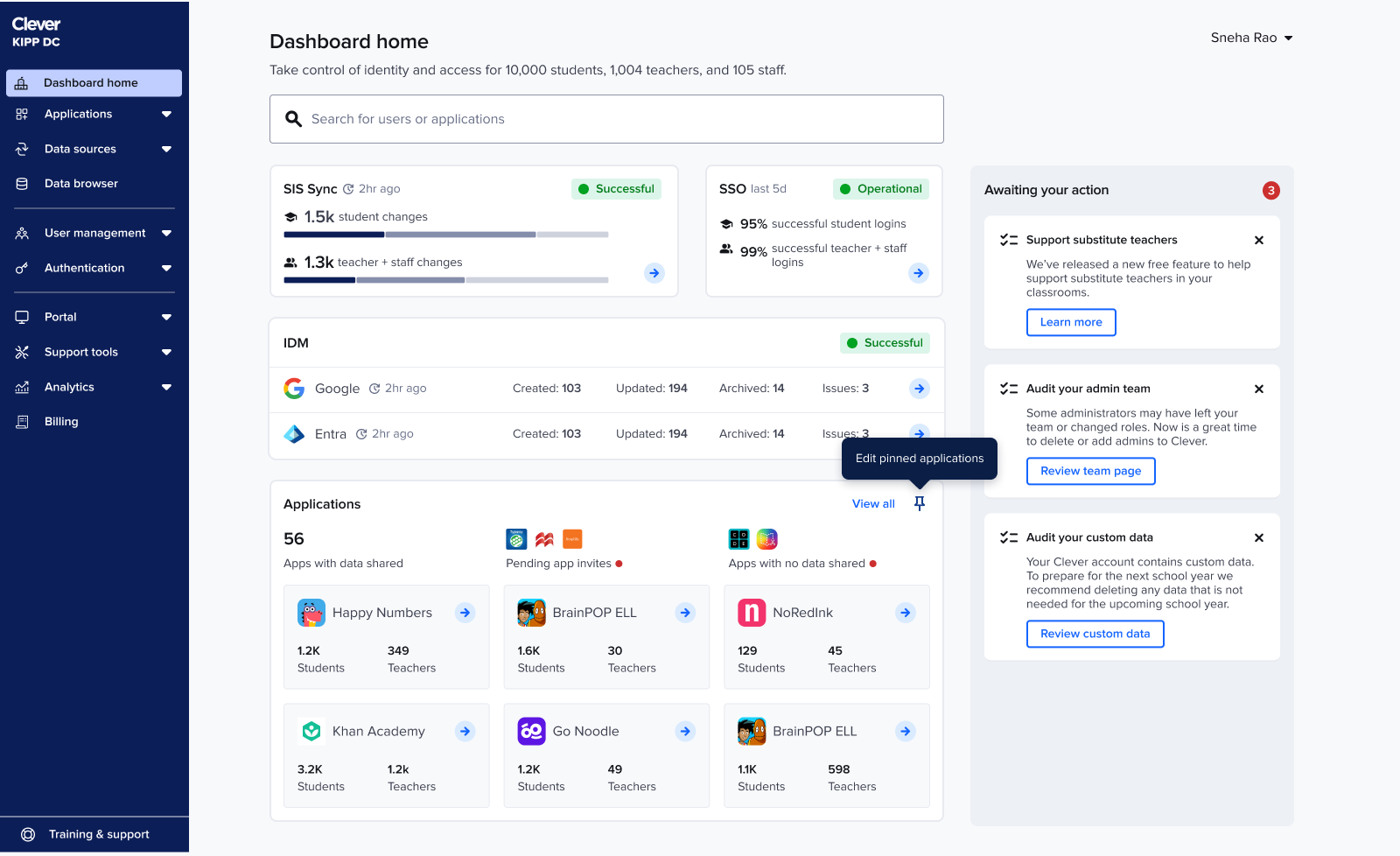
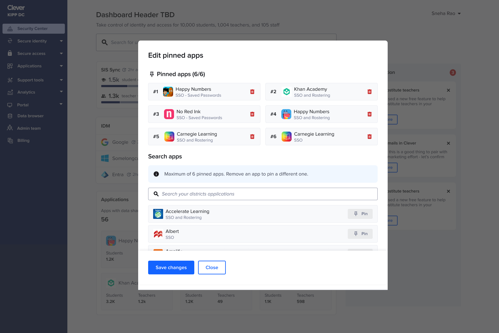
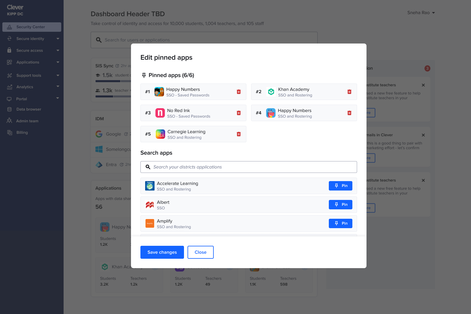
App pinning
Admins tracked the same handful of apps daily, so I added the ability to pin up to six apps.
This restored app visibility without overwhelming the page and naturally adapted to seasonality. For example: during testing season admins keep tabs on a different set of apps than the ones during back to school season.
Error states
Even though the main story focuses on happy paths, every status on the new homepage required fully considered, intentionally designed error states (such as when a sync failed or when there were security incidents). As the homepage evolved each shift changed how errors should surface, stack, and guide admins.
Throughout each iteration, I re-mapped the error logic to ensure the hierarchy still made sense within the new layouts, and that critical issues were always surfaced with the right clarity and priority. Error states weren’t something I bolted on at the end they were embedded into the system thinking from the very beginning.
Impact
The remainder of the homepage launched to tens of thousands of IT admins and drove:
15% increase in traffic to access logs
22% faster time-to-action for security workflows
This project transformed a fragmented legacy experience into a cohesive, security-forward system. It required system thinking, deep research, and careful alignment across product, design, and engineering.