Cybersecurity Dashboard
ROLE
Lead Product Designer
CROSS FUNCTIONAL TEAM
VP of Product, Director of Product, Design Manager, 5 Product Designers, 3 PMs, 1 PMM, 2 CSMs
MY PRODUCT TEAM
1 PM, 1 Eng Manager, 8 Engineers
TIMELINE
August 2024 - Present
PROJECT OVERVIEW
For the past decade, Clever has helped school IT administrators streamline account management through secure automated rostering, ensuring smooth data flow between systems and reducing login errors.
In the last three years, Clever has expanded into identity and access management to address the rise in cybersecurity threats, particularly ransomware attacks targeting student data. This shift has positioned Clever as a cybersecurity provider for K-12 education.
While we've added new features to our Dashboard, it still felt rooted in rostering, making it seem more like a tool with cybersecurity features rather than a dedicated cybersecurity product. This highlights the need for a more cohesive Dashboard UX that aligns with Clever’s expanded focus on cybersecurity.
Discovery
On September 3, 2022, the Los Angeles Unified School District was targeted in a ransomware attack that exposed sensitive student data. Within weeks, the attackers threatened to publish the data on the dark web. Unfortunately, this is not an isolated event and cybersecurity has become a top-of-mind concern for public school districts nationwide.

These incidents raised an important question: How might Clever help district administrators feel more in control of their security posture before an incident happens?
To understand the problem, I conducted user and stakeholder interviews and spoke with our Onboarding and Customer Success teams.
What we heard
Across interviews, six consistent pain points emerged that highlighted how fragmented cybersecurity ownership had become inside districts:
Personnel and budget constraints – Many districts have limited technical resources, forcing them to prioritize cost over security.
Reactive mindset – Security only becomes a priority after an incident or insurance requirement.
Siloed teams – The person managing Clever daily isn’t the same one responsible for cybersecurity strategy.
Responsibility gaps – Ownership of Clever varies across roles, leading to inconsistent security oversight.
Persuading upper management – Admins struggle to get leadership buy-in for proactive security initiatives.
Varied approaches – Smaller districts act reactively, while larger ones prefer integrated, preventive solutions.
Framing for this UX vision: designing for 2 types of admins
Early research revealed two distinct user groups using the Clever Dashboard with very different goals. To craft a unified experience, I needed to understand each admin’s motivations and jobs to be done.

Shared design opportunity: How might we encourage Joe to bring Brenda into the dashboard and collaborate on secure operations together?
This insight became the foundation of the UX vision: evolving Clever’s dashboard from a rostering tool into a shared platform that connects operations and cybersecurity through approachable, collaborative design.
UX Audit based on each JTBD
To translate this vision into tangible opportunities, I conducted a UX audit anchored in the “jobs to be done” of cybersecurity-minded district admins.
This helped surface major experience gaps across the Dashboard:
Homepage lacks strategic focus – The current homepage duplicated the Applications table, offering no actionable insight.
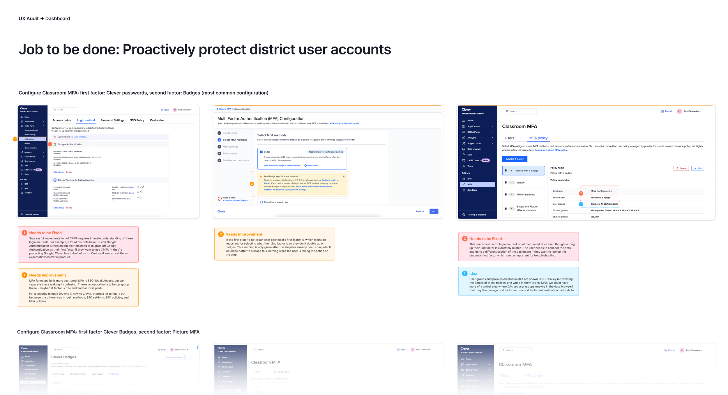
Security features lack visibility – Key cybersecurity tools were buried across multiple tabs.
Features lack integration – Related security actions (resets, monitoring, recovery) were fragmented.
Alert fatigue – Unimportant alerts made it hard to distinguish what truly mattered.
These findings made it clear that the homepage was the single most visible and high-leverage surface to start with.
Dashboard homepage redesign
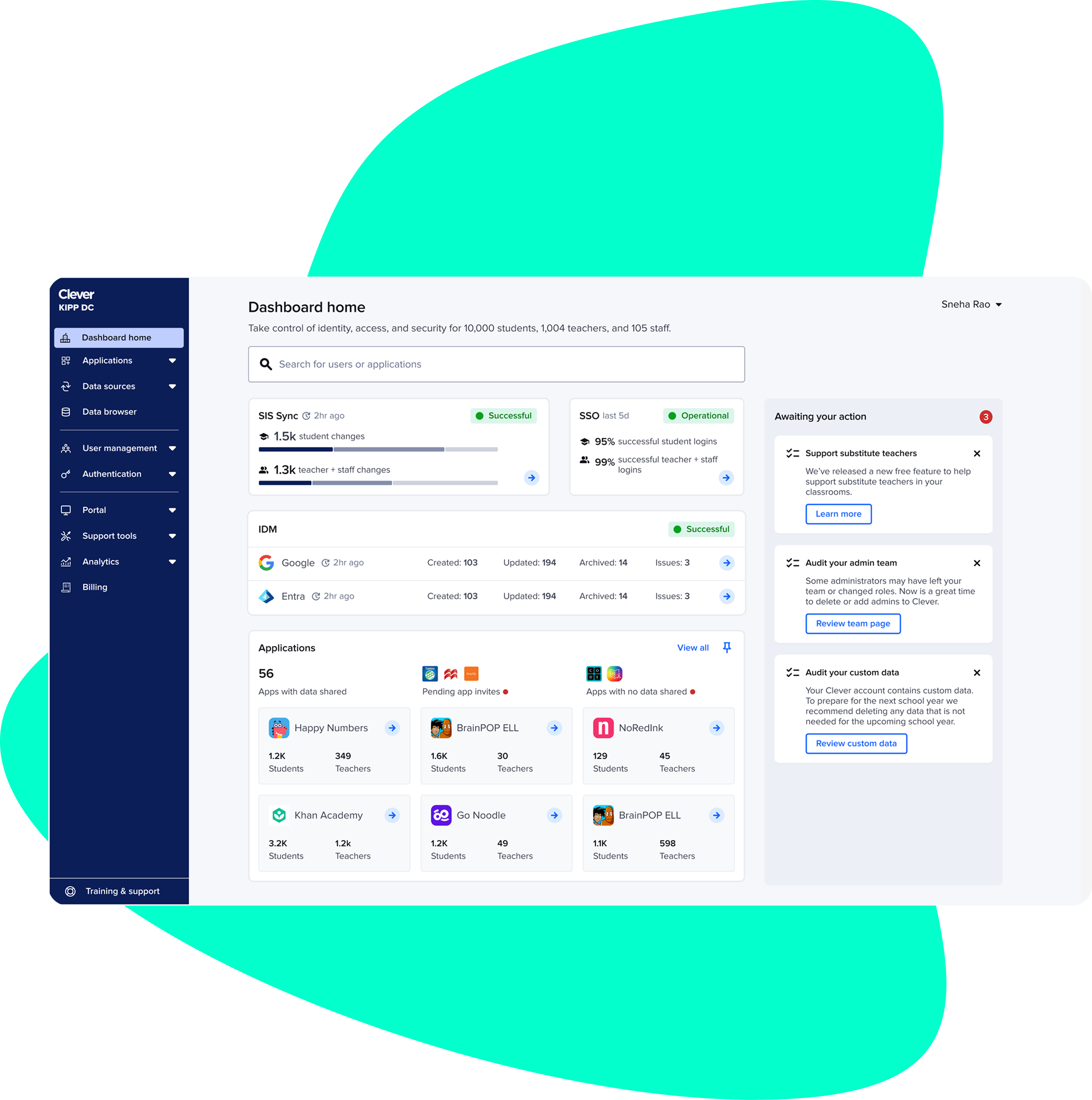
Original state: A page without purpose
The original homepage displayed the same Applications table users could access on the next tab, taking up most of the screen with duplicate data. It didn’t communicate system health or security status, and users described it as something they never paid attention to.
Opportunity: Transform the homepage into a control center — a space that shows what’s working, what’s broken, and what needs attention.

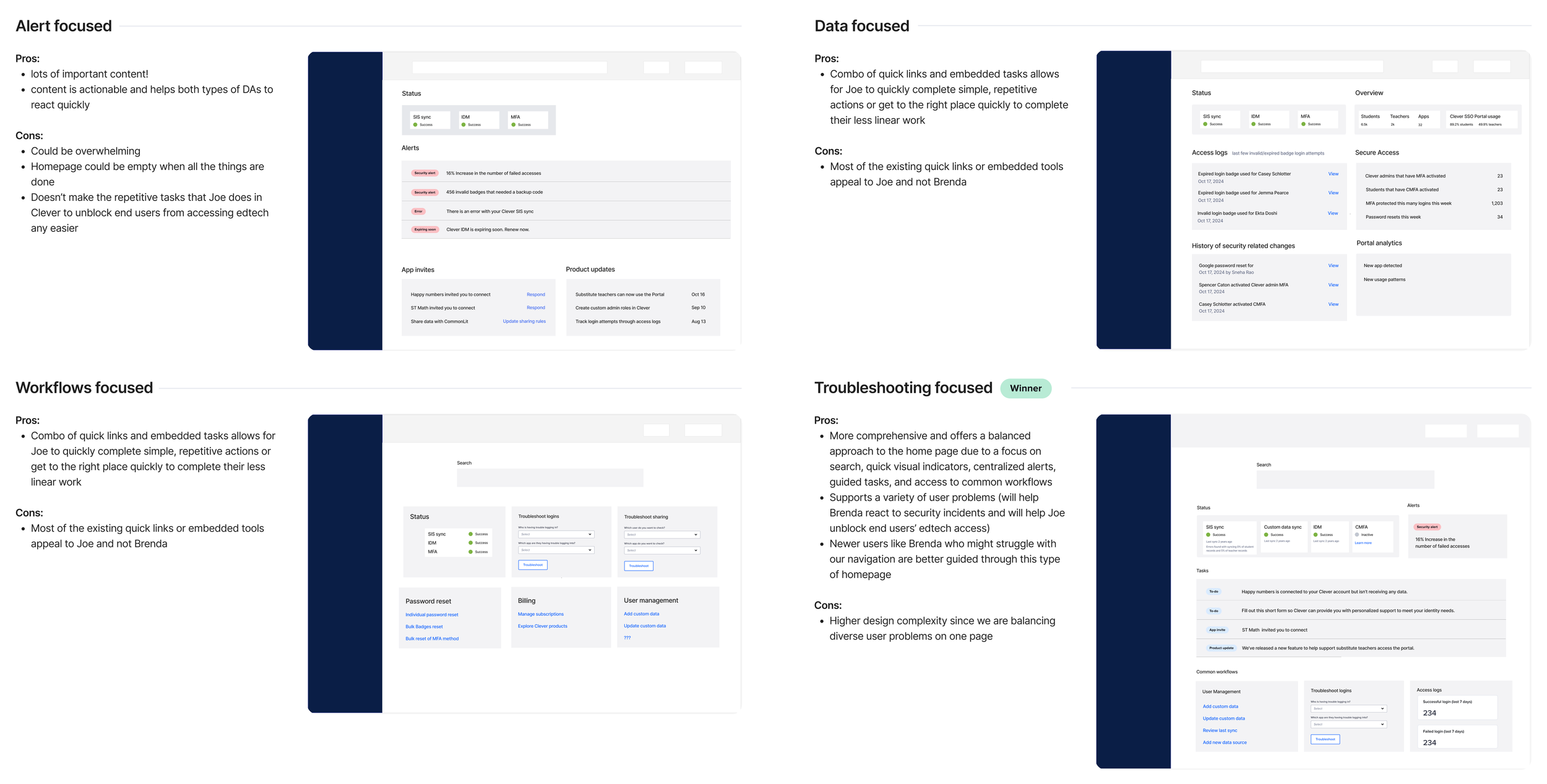
Initial concepts
From this point, I explored various design directions for the dashboard homepage, considering several extreme and more unbalanced approaches. I carefully evaluated the trade-offs of each direction and discussed them with the executive team at Clever to ensure alignment with business goals and user needs. After thorough consideration, we ultimately decided to pursue a troubleshooting-focused direction, aimed at helping IT admins to quickly respond to security incidents and efficiently unblock students' access to edtech tools.
Focus on search
After deciding to focus the homepage around troubleshooting, I facilitated a large brainstorming session with our internal customer-facing teams to identify the most common troubleshooting actions within the dashboard. Through this process, I discovered that the majority of cybersecurity-related troubleshooting tasks actually begin with search. As a result, I adjusted the homepage design to prioritize search functionality, ensuring that security-related actions could be accessed directly from search results. My vision is to make search a central, prominent feature on the homepage, with relevant security actions seamlessly integrated into search results. Clever has also been doing a lot of brand orientation around identities - and search is the gateway to identities in product.
Before
The original Omnisearch experience was frustratingly limited: users could view only 3 collections and 3 results per collection, no matter how many matched their query. This made it especially difficult in cases where multiple students shared the same name - a common occurrence that forced IT admins to dig through unrelated results or abandon the search altogether. In time-sensitive situations, many defaulted to using the Data Browser, a slower, more manual tool that pulled them out of flow.
I overhauled the search experience to better support IT admin’s cybersecurity workflows.
After
As part of a larger homepage redesign, we chose to build and release improvements incrementally. This allowed us to ship high-impact changes like the redesigned search ahead of the rest of the homepage work, giving users immediate value while keeping momentum across the team. With the new design, users can:
See matching results across all collection types, with up to 30 results per collection
Filter results by collection type to narrow down large result sets
Take direct action from the search results, including: Impersonating users, Viewing access logs, Resetting passwords
Iteration 1: Introducing system statuses
My earliest explorations focused on reimagining the homepage layout.
I initially grouped system statuses (SIS Sync, IDM, SSO) at the top and placed Tasks further down, under the assumption that admins would prioritize system health over growth nudges.
However, internal stakeholders flagged that Tasks - Clever’s main communication and conversion channel = were now buried too low. This created tension between usability and business goals: users didn’t love Tasks, but Clever depended on them.
To balance business needs with usability, I introduced a right-side panel layout, giving Tasks visibility without disrupting the main information hierarchy.
Result:
+15% increase in App Invite task completion
+20% increase in Audit Data task completion

Iteration 2: Increasing information density
Post-experiment, I gathered two key insights:
Users missed quick access to Applications, saying they often “kept tabs” on certain apps.
Stakeholders felt the page lacked density — every module visually carried equal weight.
This led me to rethink the layout and content hierarchy. I condensed visual spacing, refined grouping, and began exploring a feature concept inspired by user interviews: App Pinning.
Admins could pin up to six applications to their homepage — giving them a personalized, seasonal control surface (e.g., rostering apps in August, testing apps in spring). This concept balanced flexibility with clarity and resonated strongly with both users and internal partners.
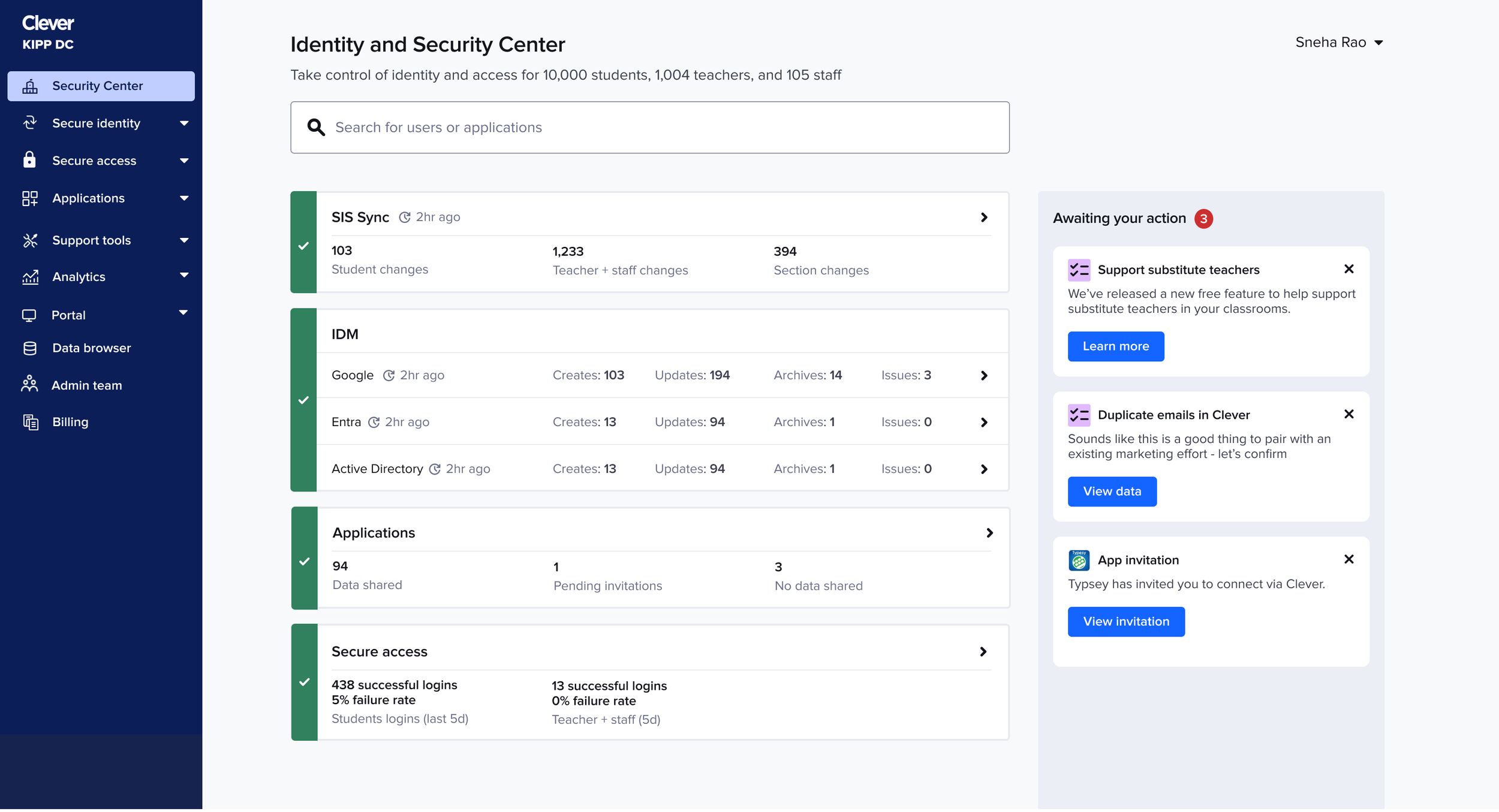
Final design: A true control center
The final shipped version struck the balance between monitoring, action, and growth.
System statuses were simplified into clear, scannable cards showing progress and uptime.
The right panel persisted as the “Awaiting your action” area — making Clever’s communications feel contextual rather than intrusive.
Applications were reintroduced more meaningfully, giving users visibility into their most-used apps and surfacing key metrics (students, teachers, and sync health).
This design unified the dashboard under a new organizing principle: Show what’s healthy, what needs attention, and what’s next.
Impact:
+15 % increase in Task completion
+24.7% improvement in search engagement — 95.5% of users now take action after searching, compared to 76.6% previously.
+25% faster issue detection in usability sessions

Conclusion
Reflection
This project stretched me to balance competing priorities — user trust, business growth, and visual clarity — and turn them into a cohesive experience. It required stepping back to see the system, listening deeply to users and stakeholders, and using design to bring simplicity to complexity.
What shipped wasn’t just a homepage, but a foundation for how Clever communicates trust, control, and security to millions of admins nationwide.