I led a team of 8 Product Designers and 2 Brand Designers to redesign Dewey, our design system, and PMd the implementation of those components. This work has unlocked a tremendous amount of efficiency for our design and 50+ person engineering org. It’s helped achieve visual coherence, sped up designers because there’s less ad-hoc QAing, and has sped up engineers through more confident testing and better documentation. We also now have a single source of truth and unity between figma components and github due to the tool I introduced to the org called Storybook.
Team
8 product designers, 2 brand designers
Enterprise SaaS / Design systems / Systems thinking
Focus
Role
Lead Product Designer
How we got here
2017-2020
Dewey 1.0 introduced our earliest components.
Dewey 2.0 improved visuals but lacked an implementation plan, leading to piecemeal adoption.
2021
When I joined Clever, designers were using Dewey 2.0 - but inconsistently.
Designers often created one-off components because they didn’t know what already existed. New hires duplicated patterns. Some components lived only in individual codebases, not Dewey. Figma and GitHub drifted apart, creating mismatches between design and production.
2022
As the team doubled in size, Dewey’s cracks became impossible to ignore. Significant issues and frustration with Dewey emerged as a result of the increased team size and existing system limitations.
Problems with Dewey
01
Multiple one-off versions of the same component
Teams were stretched thin and often built custom components instead of updating Dewey. This created visual and behavioral inconsistencies across the product.
02
No Unified Source of Truth for Dewey
Designs in Figma didn’t match what existed in GitHub. Components behaved differently across our UI kit and the GitHub repo.
03
Lack of Ownership and Systematic Process
Dewey operated on a volunteer basis, leading to its maintenance being deprioritized due to higher priority project tasks. Without structure or prioritization, designers struggled to contribute effectively.
04
Challenges for New Designers
Outdated files, missing guidelines, and undocumented changes made onboarding painful and confusing.
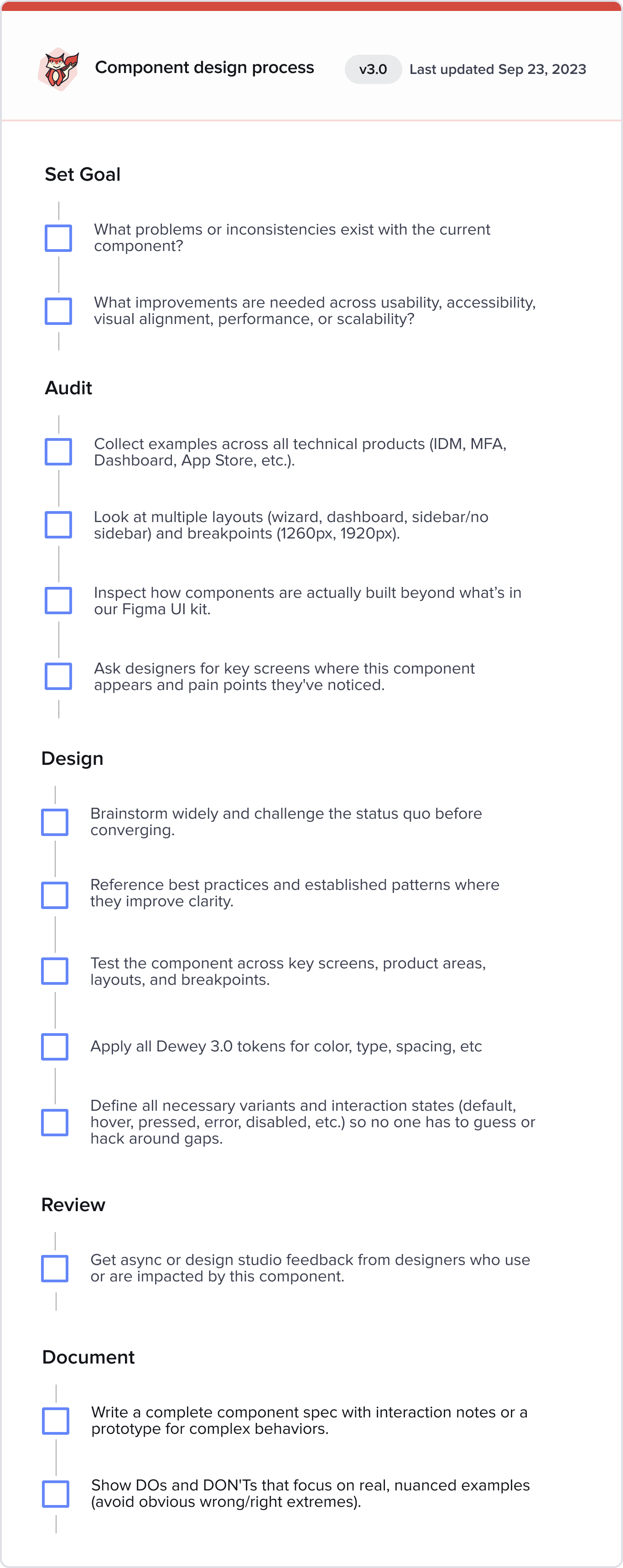
How I drove the redesign
Full system audit
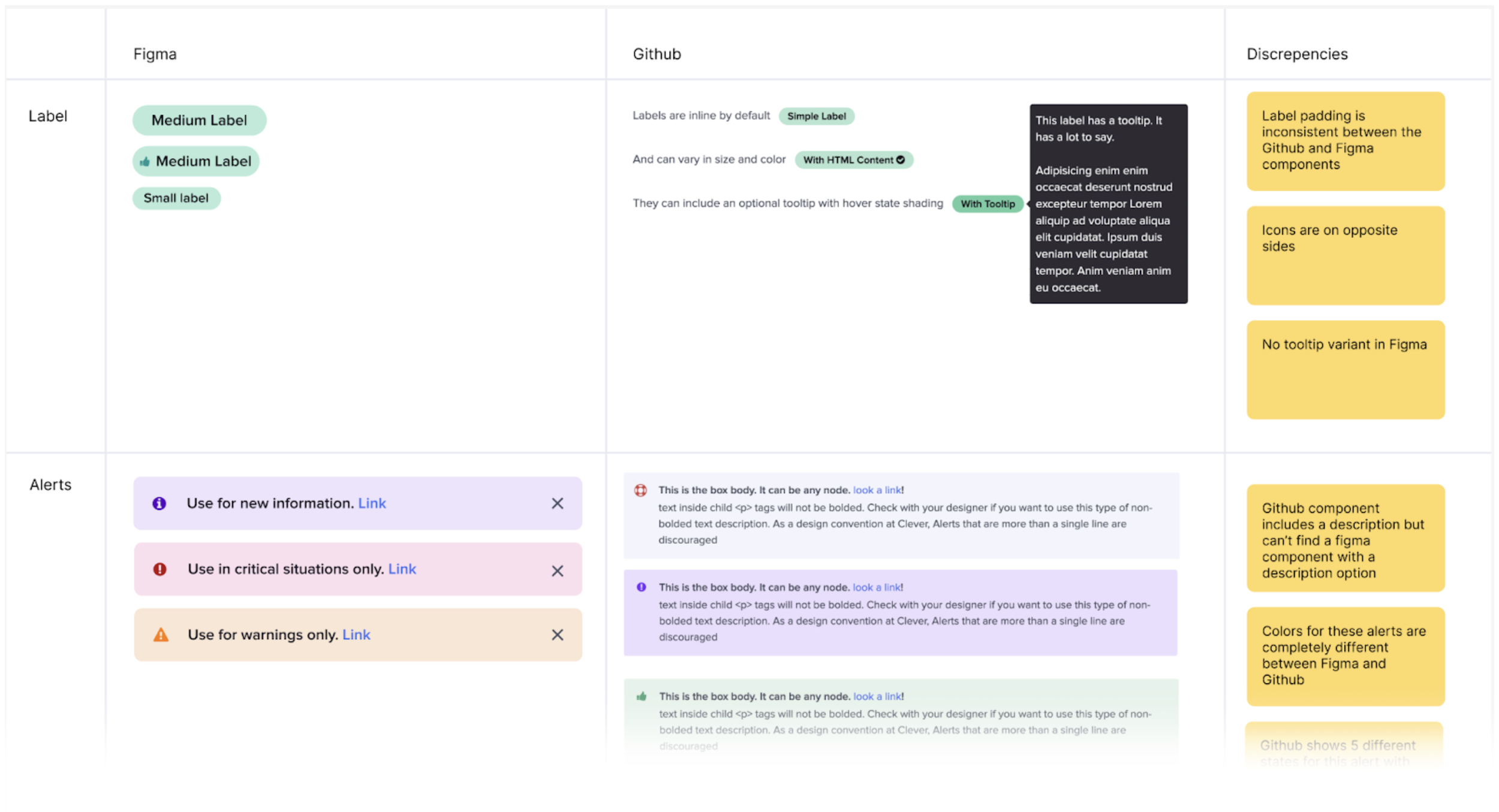
I audited all 65 Dewey components across Figma and GitHub.This helped me:
Identify discrepancies (from small visual mismatches to missing variants).
Understand component complexity.
Prioritize what needed a ground-up redesign vs light refactoring.
Build a roadmap that the entire team could commit to.
Establishing design principles
To create alignment, I facilitated a workshop with product leadership and the full design team. After rounds of discussion and dot voting, we aligned on four principles that guided every component decision:
Clear – Easy to understand: what something is, what it does.
Inclusive – Designed for all contexts and all users.
Efficient – Reduces cognitive and interaction effort.
Joyful – Makes even technical workflows feel human and delightful.
These principles became our north star and removed ambiguity in decision-making.

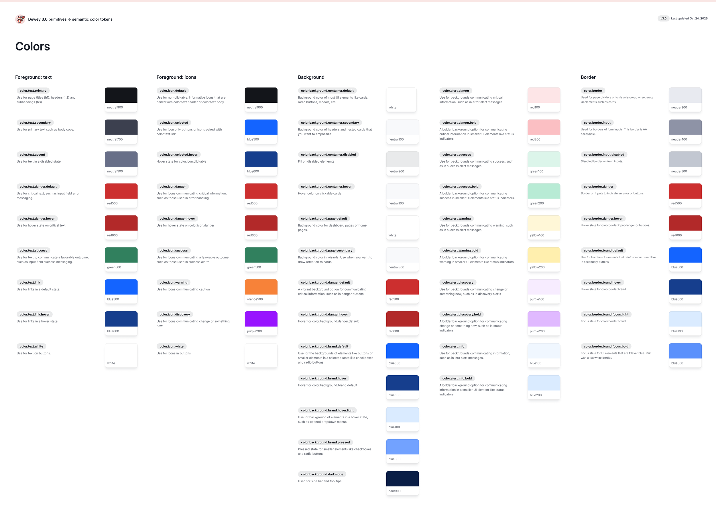
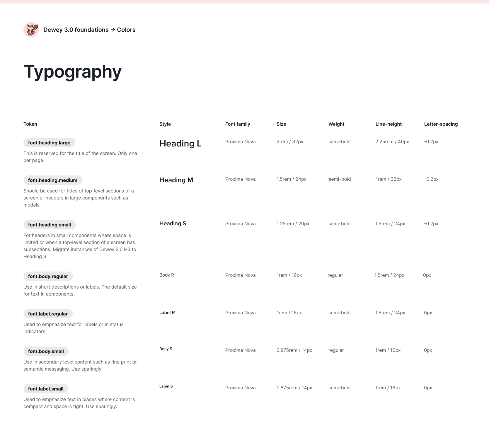
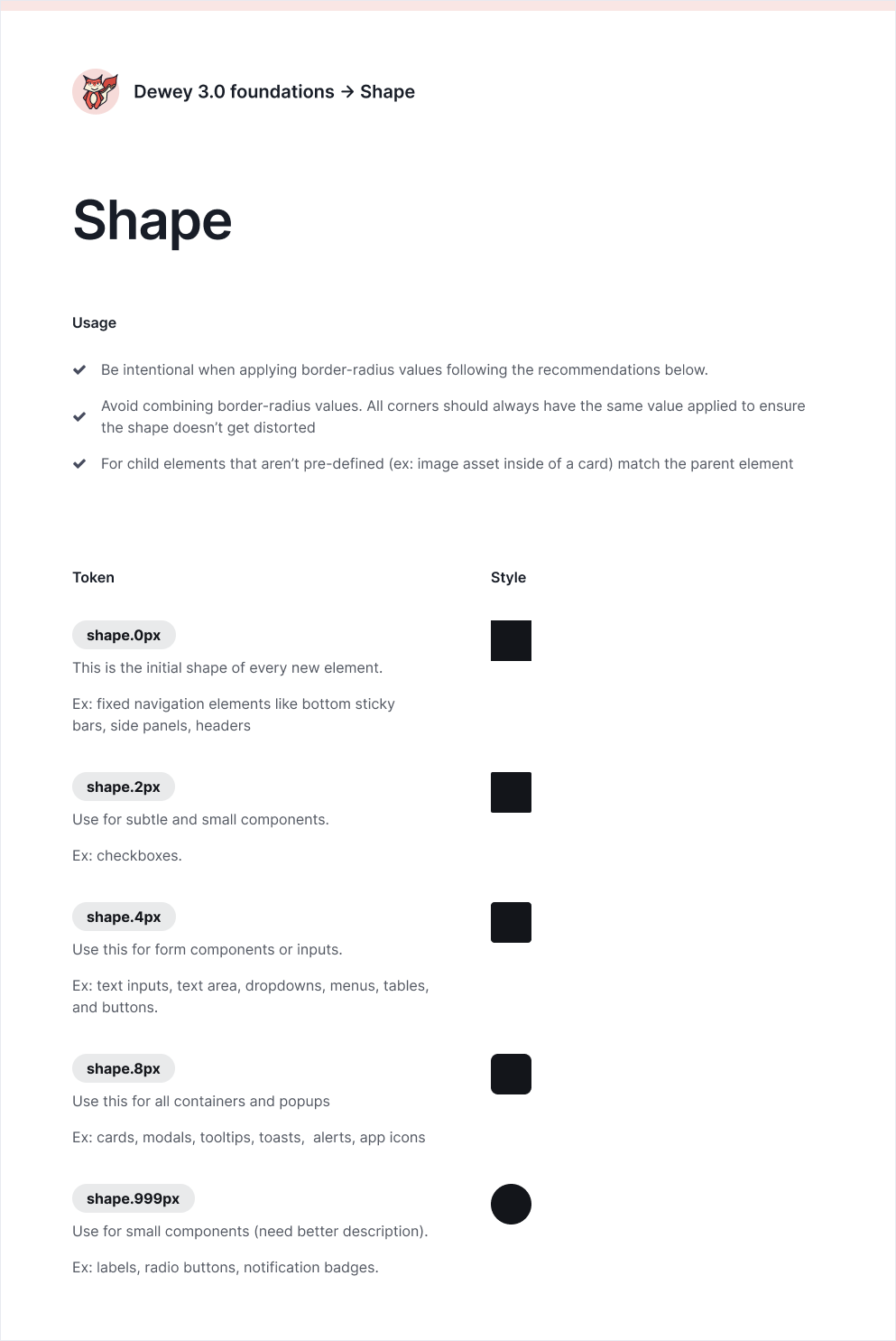
Introducing design tokens
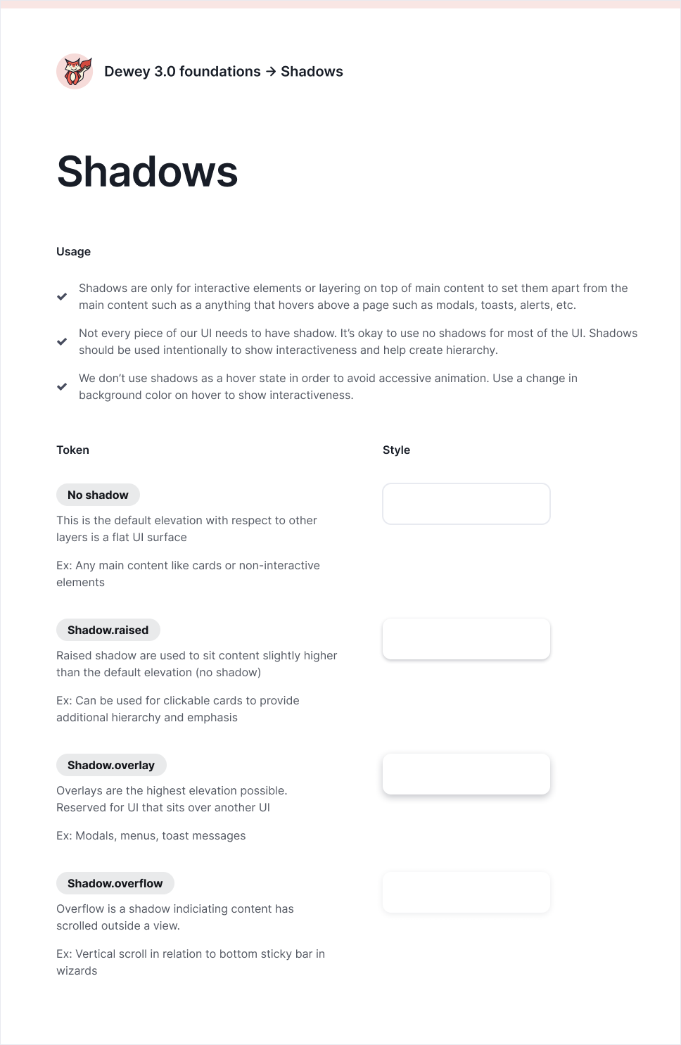
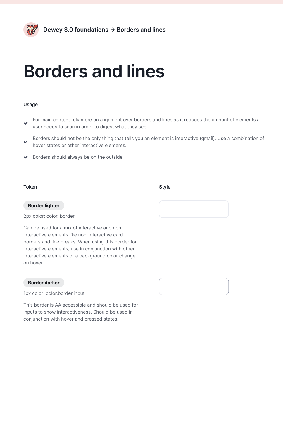
I introduced tokens to codify our visual foundations: line thickness, border radii, padding scales, shadows, and more.
This work required extensive stress testing. For instance, I would refine a visual element like border thickness and color, only to realize later that my choices didn’t harmonize well with the shadow tokens I envisioned for the system. It required balancing progress in one area while ensuring that all design decisions worked together cohesively for the system.
Design leadership & collaboration
Creating a shared process
I developed a structured workflow for how designers contribute to Dewey. It included steps for identifying component issues, gathering inspiration, stress-testing on real screens, and documenting decisions.
My goal: create a collaborative design system culture rather than a top-down one.
I delegated component ownership to the whole team.
Paired with each designer to maintain quality.
Facilitated critiques and feedback loops.
Held the system-level perspective and made final calls.
This approach created collective ownership - one of the biggest reasons Dewey 3.0 is widely adopted today
Organizing workstreams
Across two years, I facilitated three multi-day design on-sites where we tackled increasingly complex layers of the system:
Phase 1 – Dec 2022 (Atomic):
Buttons, checkboxes, radios, inputs, selects, multiselects, status indicators, alerts, cards, headers, switches.
Phase 2 – May 2023 (Molecular):
Multi-step wizard, file input, tables, modals, filters.
Phase 3 – June 2024 (Complex patterns):
Card variants with errors, advanced filtering, processing states, edge-case error handling.
I also created continuous feedback channels with the design team and front-end leads, maintained a Dewey backlog, and advocated for resourcing additional on-sites when needed.
Partnering with Eng
Dewey can’t succeed without engineering.
I partnered closely with our engineering lead to secure buy-in across product teams. Together, we:
Rotated front-end leads from each product team onto Dewey.
Established a governance model owned jointly by design + engineering.
Standardized how we build, test, and document components.
Together we led the rollout of Storybook as the single source of truth for component documentation. It aligned designers and engineers around shared specs and eliminated drift between Figma and GitHub.
Key component redesigns
File upload component
Before: A broken, inconsistent component with multiple team-specific versions. Issues included: inconsistent progress UI, unreliable multi-file handling, missing error patterns, poor support for large uploads
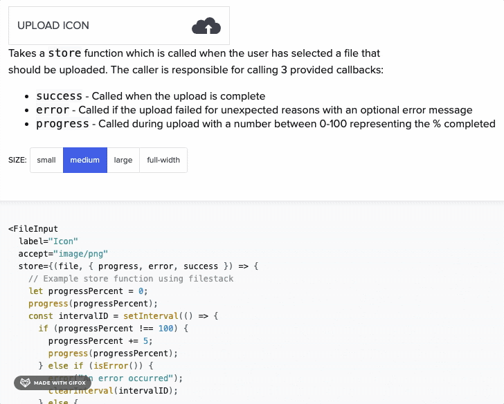
After: A fully unified system that supports: simultaneous uploads, live processing indicators, consistent download/delete behaviors, navigation-safe uploads (users can continue working while uploading)
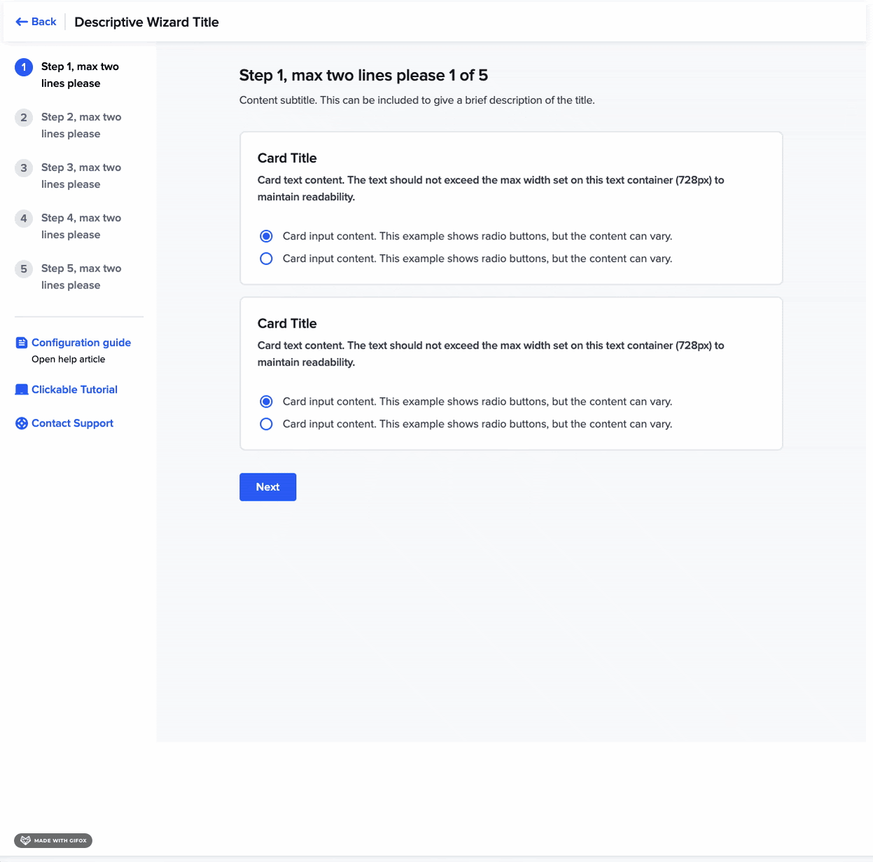
Wizard component
Before: Visually outdated, rigid, and difficult to apply consistently.
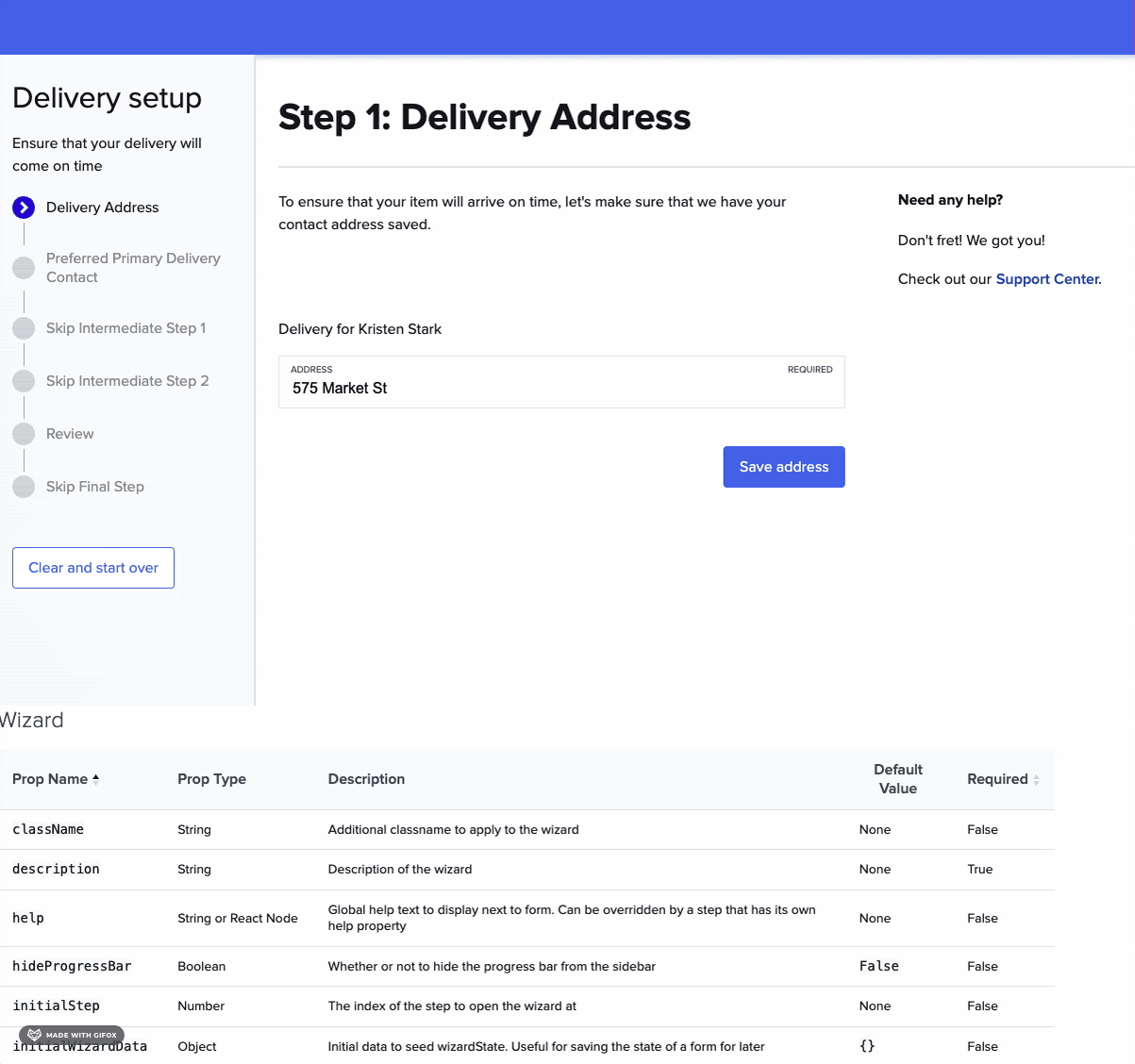
After: A scalable, modern pattern with consistent step behaviors, clearer hierarchy, and added flexibility for multi-step set up flows.
Learnings
Balancing Consistency with Creativity: While governing the design system, I’ve had to strike a delicate balance between maintaining consistency across products and allowing other designers the freedom to innovate. It's challenging to ensure that design decisions align with the overall system without stifling creativity, but I've learned that clear guidelines and open communication help other designers feel empowered while keeping the system unified.
Ensuring Scalability and Flexibility: Redesigning and now governing the design system has made me more mindful of scalability. As I introduce new components or guidelines, I constantly think about future needs and how flexible the system is for different teams. The key reflection for me has been understanding the importance of setting up structures that can evolve with the product while also staying true to the initial vision.