Providing space effects to warfighters around the world
Team: Design-PM-Dev team of 8
Duration: Nov 2019 - Present
Focus: Research, Web Design

Overview
Space Support Requests (SSRs) are the avenue through which warfighters around the world request support from space assets (satellites, rockets, etc). These requests are processed through the CSpOC, who then task them out to the units that operate those assets.
The SpaceForce collaborated with Pivotal Labs to ship a product for warfighters to easily request support from space assets.
Problem Discovery
USER NEEDS


Warfighter
“boots on the ground” needs a space effect so they can execute their missions around the world
Coordinator
receive requests and need to understand them so they can task them to assignees correctly
Assignee
70+ units around the world that operate the military’s space assets. They need to execute requests on time so warfighters can complete their missions.

USER AND BUSINESS OUTCOMES
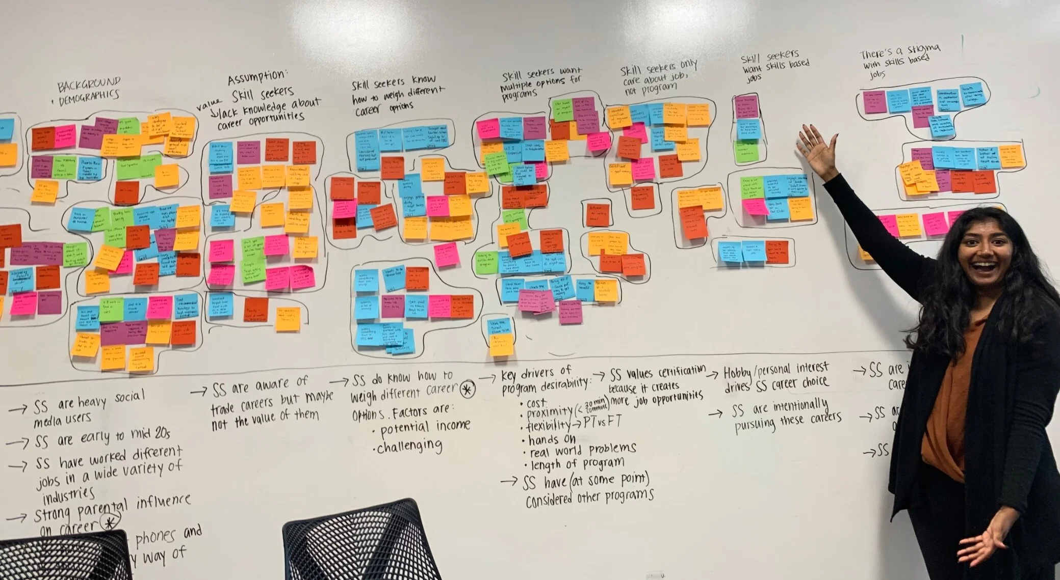
Meritize reached skill-seekers only in the final two phases of their journey to starting a vocational training program. After weeks of research, we saw an opportunity for Meritize to begin interacting with skill-seekers earlier in their journey which we believed would lead to several user and business outcomes:
Allow skill seekers to explore and evaluate different vocational training programs that fit their unique interests and needs
Shift from a “pull” to a “push” customer acquisition model by changing how Meritize reached customers from getting school referrals to reaching customers directly
Increase access to training programs would long-term lead to an increase in Meritize loan applications
Solution Validating and Refining
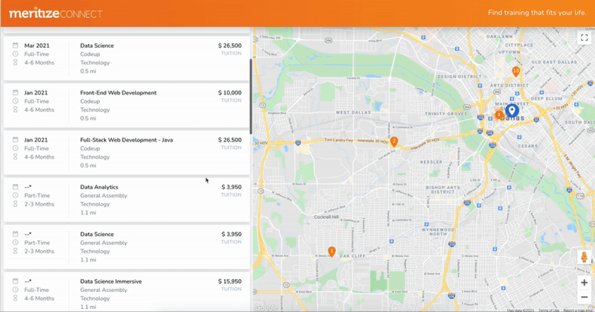
GOOGLE MAP API
Skill seekers value the ability to see exactly how far away a program is from them. They’re willing to travel farther for a program if it fits their other needs but needed a way to visualize these tradeoffs while weighing program options.
Giving users an immersive location experience allowed them to have the context they needed for their decision making. There were numerous interactions I had to think through with the map such as:
What happens when you click on a location pin in the map?
How will the map UX translate to mobile?
How do you represent schools with multiple programs on a map since they’re in the same location?
See how I handled all of these interaction design challenges here.
MOBILE DESIGNS
I tried to maintain as much consistency between desktop and mobile as possible, to make it easier for developers and to provide a seamless experience for users who may be visiting our app on different devices.
Maps on mobile have several usability considerations like gesture ambiguity (scrolling vs. panning) and map pinpoints conflicted with touch target sizes, so I designed maps on mobile to be an option for users to toggle into, and that location data would be presented as a list ordered by mileage from the searched location.

DESIGNING FOR CONVERSION
Stakeholders were pushing conversion and wanted the main CTA - “Apply for a Loan” to be in the global header which would appear on every screen. In user testing, I found this really put off users, made them distrust the product, and applying for a loan didn’t fit in the their work flow when they were searching for training programs. After searching for a program their next step was to apply to the program, not apply for a loan.
After several conversations with stakeholders, where I presented different options for designs, I changed the button to be “get your rate” and moved it to the program details page. This was a decision that still pushed for conversion but also respected user needs.
